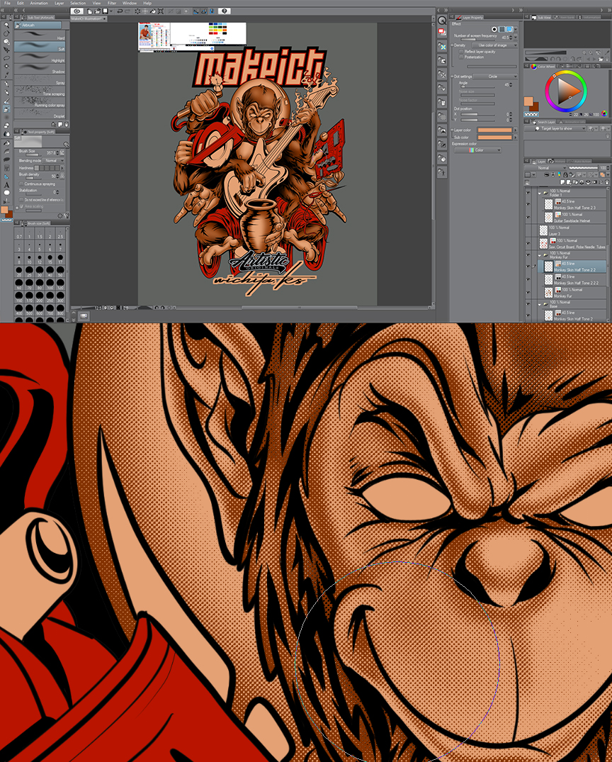
Does anyone have experience screen printing half tones. I’ve got the half tones figured out as far as how to create them, beautifully I might add, but I’m not sure what size the dots should be. I don’t want that pop art look where you can see the dots. I’d like them to be as invisible as possible.
The best i can think is to just test it by setting up different half tone point sizes, densities and gradations and make a screen and actually print it.
What is the Proper Frequency?
This is a topic that everyone wants a complex formula for. There have been numerous articles touting the theories about what LPI to use. I think it is much simpler.
Here are easy to remember frequencies:
Simple spot color jobs with some tints 35lpi
More detailed spot color images with lots of shading 45lpi
Photorealistic images – manual press 55lpi
Photorealistic images – automatic press 65lpi
That’s really useful. I kind of eyeballed it and ended up around 40 so I’m glad I’m in there in the right ballpark. I’ve got it setup so that I can change the frequency at will.